
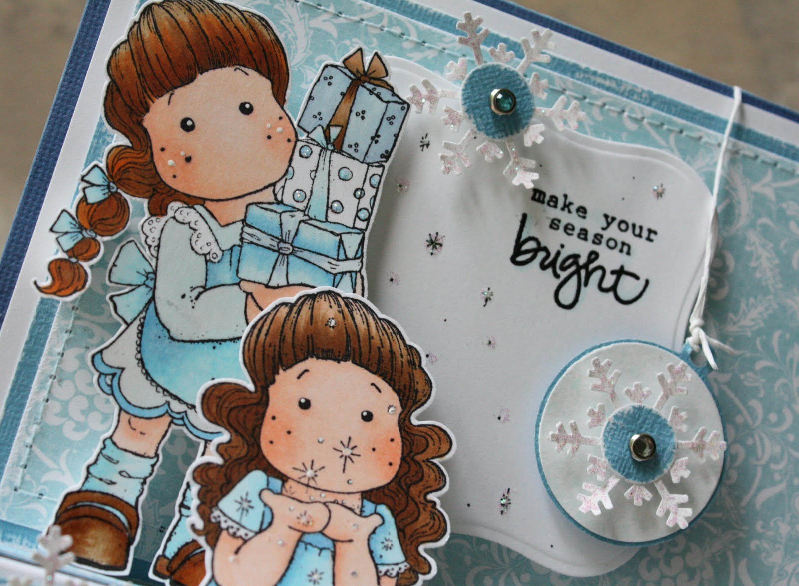
 Made this card last weekend and didn't want to post it until after the Magnolia-licious blog hop was over because I had another card posted for that. I thought it would be best to post it this weekend.
I've never tried doing the European coloring style that I love seeing so much so after I colored this image, I felt it looked a bit too bright, crisp and clean so I needed to distress it up...I was quite nervous about doing anything more with the image as I didn't want to ruin a perfectly good colored image. Well, I just gave it a whirl. It's not exactly the European style, but I was able to gray it up a bit which helped make the card and image work better together.
 Here's a close-up of the image. (This stamp is also available for FREE in my BLOG Challenge posted last weekend. Check it out if you want this stamp!!!
 Card Details:
Stamps: Tilda with Violin (not formally released yet), The Angel Company Snowman Nativity T-2692)
Cardstock: BazzillPatterned Paper: October Afternoon Gingerbread (#PP047)
Ribbon: Silk from Michael's
Flowers: Prima (from Fairytale collection)
Martha Stewart Punch
MM photo turn (with stickles added on top)
Pearl Sewing pins (pearls colored with copic E35 then buffed to shine)
Nestabilities Oval/scallop
Liquid Pearls: Gold
DMC floss: Gold, Cream
Buttons: Basic Grey, Lasting Impressions
Copics Used:
- Hair/Violin/Shoes: E25, E31, E35, E37, E55, YR14
- Dress: RV0000, RV91, RV93, RV95
- Skin: E000, E00, E01
- "European Shading": W00, W1, W3
- Copic White Opaque for highlighting
I'm sure you're shocked with the color of her dress...I was too. I don't like purple but dark plums and blue-purples are my favorites...as long as they arent bright colors and have a little black mixed in, I'm fine with it. Take a close look at the background paper too...I used gray to highlight the music notes and some faux stitching with my copic multiliner too...Just another finishing touch.

I'm so looking forward to my long weekend. I'm not planning anything. I'd love to visit a place called The Homestead and take some pictures at least as I've been hearing some amazing things about this place. I don't think I could EVER afford a long weekend there!
I will be heading to the Quantico National Cemetery to take some pictures with my new lens too. It's a beautiful little version of Arlington National Cemetery and it's right down the street from me. It's especially beautiful on Memorial Day.
I'll be back sometime this weekend with a special Memorial Day card.
Kerry



 This was option 1:
 And this was option 2:
 I decided I liked option 2 better.

